glimm
glimm is a React and Next.js library for delightful shader-driven page transitions. It sweeps a single WebGL band across your screen during route changes or any state change you select. The new view appears underneath as the band moves. It is GPU-composited, under 10 KB, and has zero performance impact.
npm install glimmZero runtime dependencies. React 18+ and Next 13+ are peer deps.
Installation
You can install glimm using npm, or share the following prompt with a coding agent to set it up for you.
npm install glimmQuick start
Getting started takes a single step. Wrap your app in GlimmProvider so glimm is available on every route. From there, you choose how a transition gets triggered using one of the options below. The provider stays idle until it's actually needed: it builds its one WebGL context on the very first sweep, so an app that never transitions costs nothing to set up.
Triggers
There are three ways to trigger a transition, and you can use any combination across your app. TransitionLink replaces standard links when the destination is known upfront. useTransitionRouter() handles programmatic navigation, like redirects after form submissions. Or drop in <InterceptLinks /> at the root level to automatically apply transitions to all internal links without touching existing code.
Presets
glimm includes 6 built-in color palettes, each tuned to a different mood using cosine gradients. Pass any palette name as a string to the palette option. If the presets don't fit your design, you can create a custom palette using the {a,b,c,d} format, covered in Custom palette below.
Easing
Easing controls how the band speeds up and slows down as it crosses the screen. Front-loaded curves like back and easeOutQuart start fast, so the sweep feels snappy and immediate. Symmetric curves like easeInOutCubic ease in and out evenly, for a calmer, more composed feel. Pass any of the 10 built-in curves as a string, or provide your own as a (p: number) => number function.
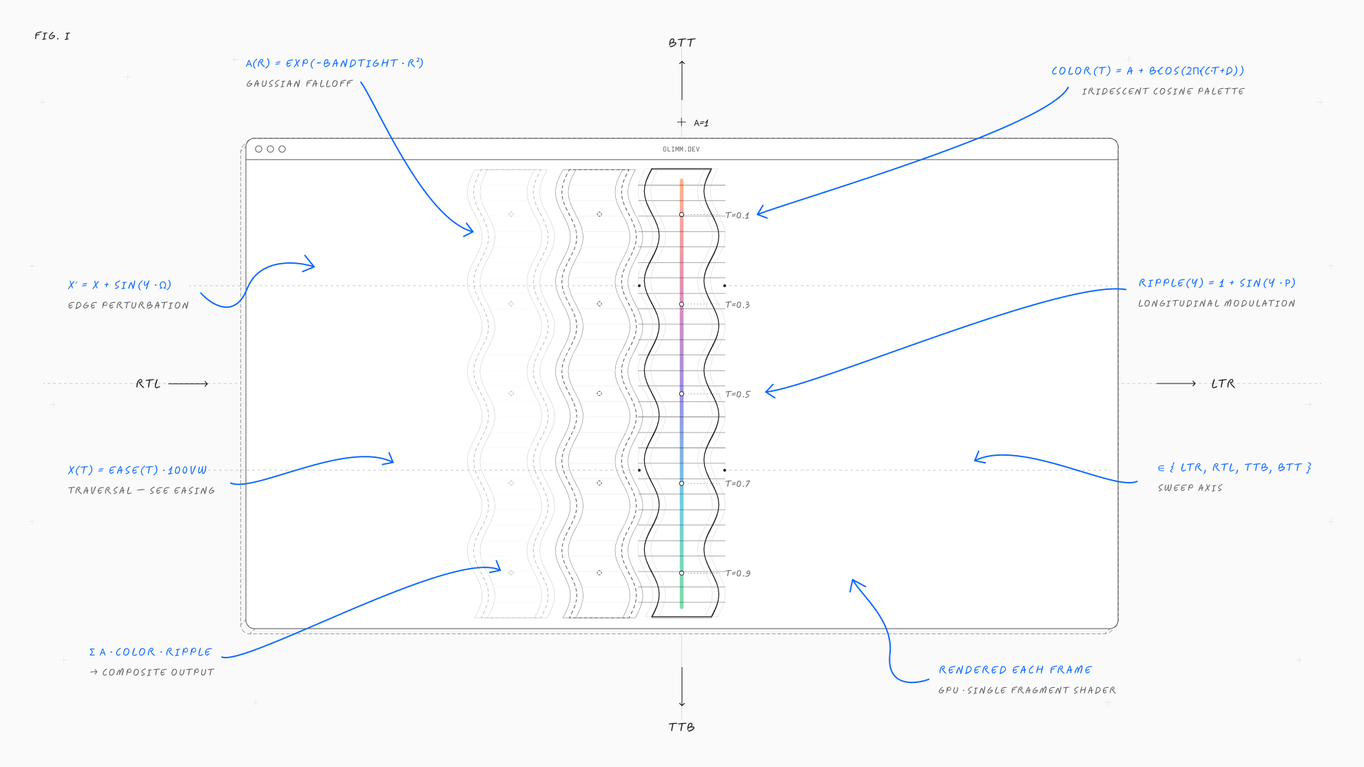
Band width
bandTight controls how concentrated the band's gaussian falloff is. Lower values produce a wider, softer band; higher values make a narrower, more focused beam.
Custom palette
Each palette is a cosine palette: color(t) = a + b·cos(2π·(c·t + d)). Each of a, b, c, d is an RGB triplet — hit Shuffle to roll one, then copy the snippet below.
Props
Everything you can pass to GlimmProvider (as defaults) or any trigger (as per-call overrides). Every option is optional.
| Prop | Type | Default | Description |
|---|---|---|---|
| palette | PaletteName | Palette | 'prism' | 6 presets or BYO {a,b,c,d}. |
| direction | 'ltr' | 'rtl' | 'ttb' | 'btt' | 'ltr' | Sweep axis + side. |
| easing | EasingName | (p) => number | 'easeInOutCubic' | 10 built-ins or custom curve. |
| sweepMs | number | 800 | Band traversal duration. |
| outroMs | number | 350 | Post-traversal alpha fade. |
| midpoint | number | 0.5 | When routes swap mid-sweep. |
| peakAlpha | number | 1 | Caps band peak (0..1.5). |
| brightness | number | 1 | RGB scale; ~0.85 on dark. |
| bandTight | number | 14 | Tightness; lower = wider. |
| waveAmount | number | 1 | Edge wave turbulence. |
| rippleAmount | number | 1 | Vertical ripple texture. |
| waveSpeed | number | 1 | Shader animation speed. |
Best practices
glimm is recommended for highlighting moments rather than just motion. Each sweep serves as a form of punctuation, reserved for state changes that require attention while allowing the rest of the app to remain quiet.
Use glimm for:
- Moments like publishing, submitting or completing where the action deserves a celebration.
- Confirmed actions: a brief pause can help users notice the new state.
- Focused modes: use it during checkout, presentations, or review screens where previous context has been replaced with new information.
- Section-level navigation: apply it for navigation that is clearly different, not for every page change in the same area.
Avoid using glimm for:
- Every internal navigation: although
<InterceptLinks />makes it easy to use everywhere, sweeping the screen with every click reduces its impact. - Passive interactions: includes hover effects, focus, tooltips, dropdowns, and menus.
- Repeated actions in a loop: example includes adding rows, checking off items, or moving through a list.
- Loading or skeleton states: glimm is meant for punctuation, not for spinning indicators.
To determine if a moment needs a glimm sweep, consider whether you would mention it in a changelog or launch post. If yes, then glimm is likely a good fit. If it's just “the user clicked something,” skip it. Using glimm sparingly makes the moments it does highlight more meaningful.